PT | BR
Yanu nasce do termo iorubá iyanu, que significa grandiosidade, poder, o extraordinário. É com essa essência que a marca se posiciona no mercado audiovisual potiguar ao transformar eventos em registros visuais memoráveis.
Yanu nasce do termo iorubá iyanu, que significa grandiosidade, poder, o extraordinário. É com essa essência que a marca se posiciona no mercado audiovisual potiguar ao transformar eventos em registros visuais memoráveis.
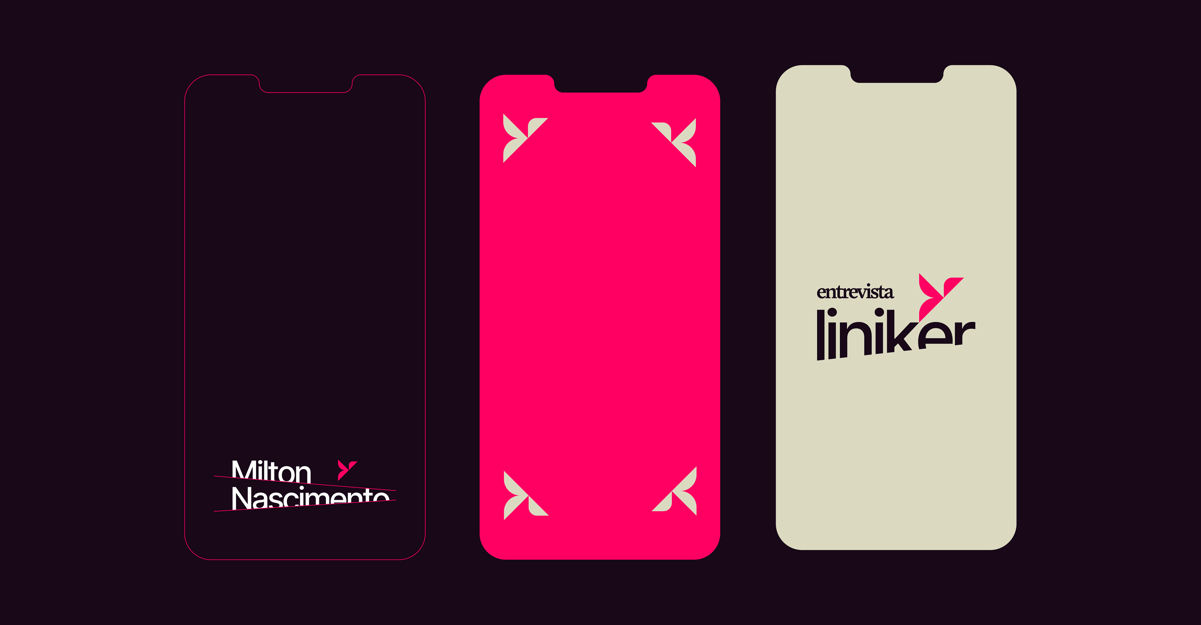
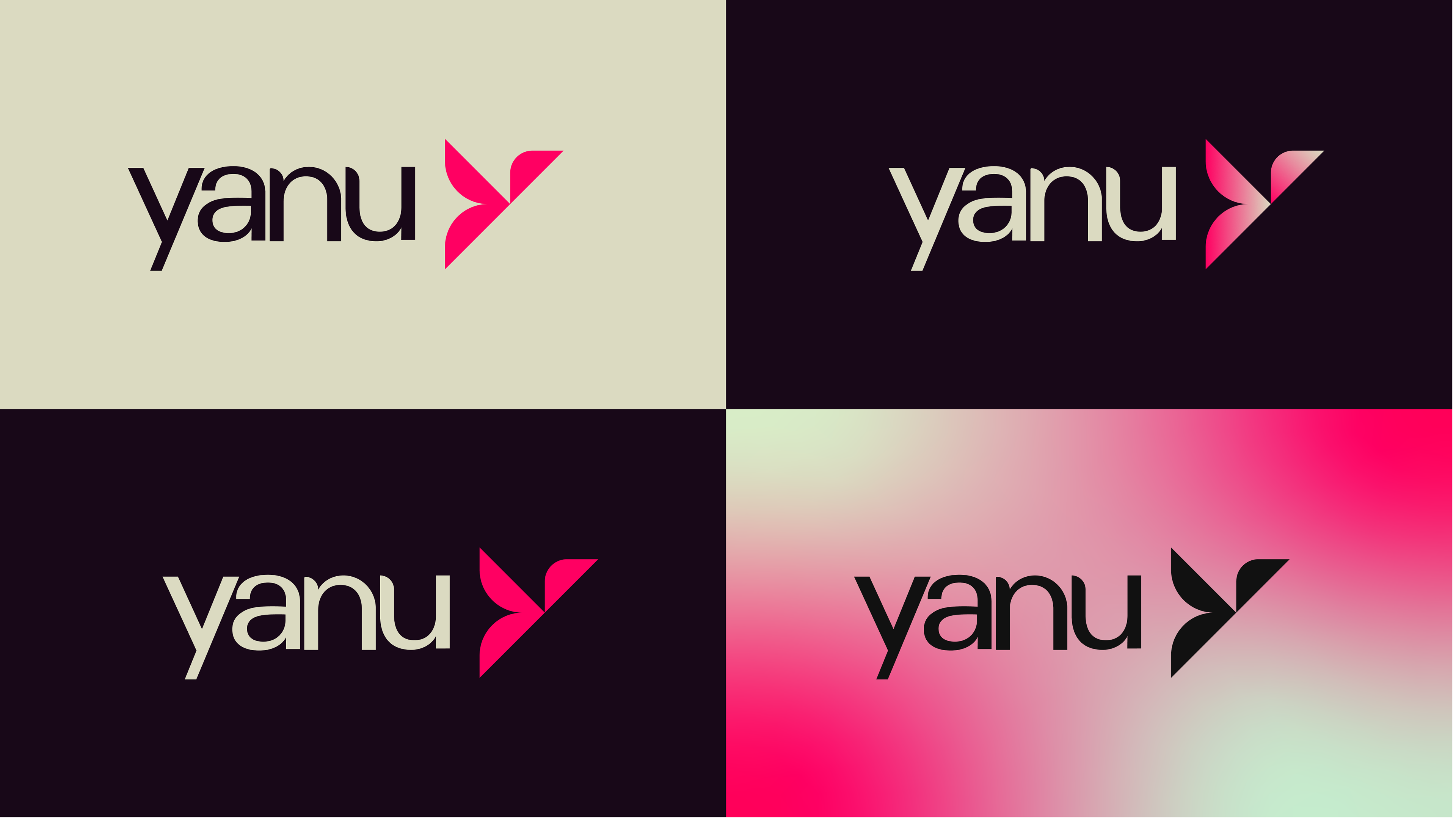
A identidade visual da Yanu é construída sobre três camadas simbólicas fundidas no ícone do logotipo: a boca, que representa comunicação; o Y, que remete diretamente ao nome; e o pássaro, associado à liberdade. O conjunto resulta em uma marca conceitual, estética e memorável.
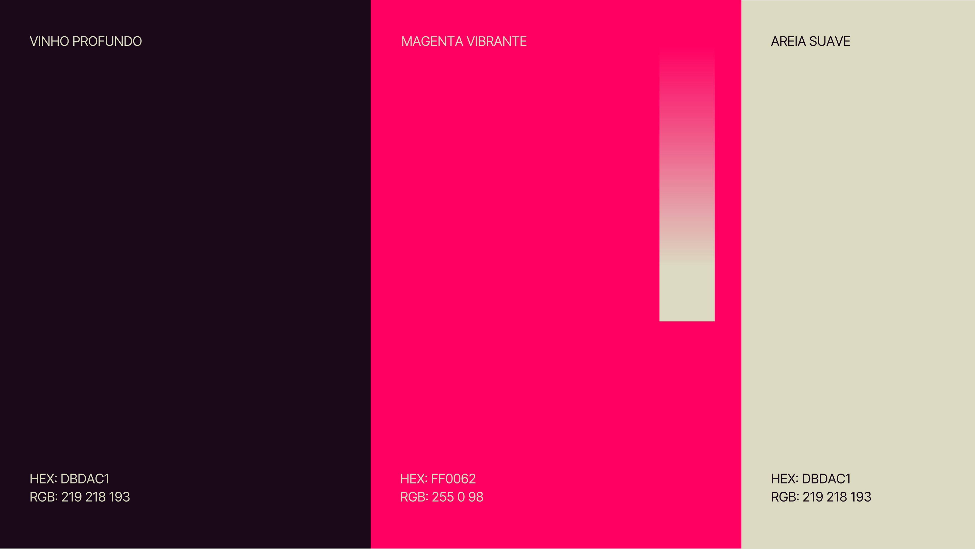
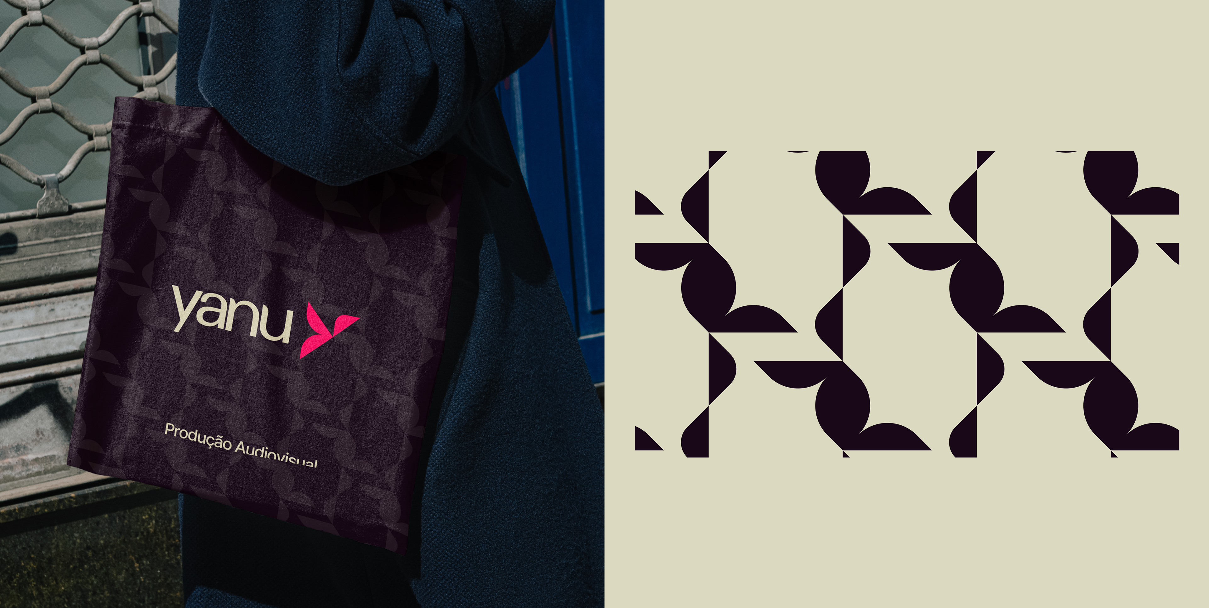
A construção visual parte do uso estratégico das cores como elementos de reconhecimento, reforçando uma presença marcante. A marca se apresenta de forma simplificada e impactante, garantindo versatilidade e fácil identificação em diferentes contextos.
EN
Yanu comes from the Yoruba term iyanu, meaning greatness, power, the extraordinary. With this essence, the brand positions itself in the audiovisual market of Rio Grande do Norte by transforming events into memorable visual records.
Yanu’s visual identity is built on three symbolic layers merged into the logo icon: the mouth, representing communication; the Y, directly referencing the name; and the bird, associated with freedom. Together, these elements create a conceptual, aesthetic, and memorable brand.
The visual construction is based on the strategic use of colors as recognition elements, reinforcing a strong presence. The brand presents itself in a simplified and impactful way, ensuring versatility and easy identification across different contexts